Activepieces home page
Search...
⌘K
Ask AI
GitHub
Pieces
Get Started
Get Started
Search...
Navigation
Product
Interface Design
Documentation
Develop Pieces
Embedding
API Reference
Deploy
Handbook
Handbook
Activepieces Handbook
Teams
Overview
AI Agent
Marketing & Content
Developer Experience & Infrastructure
Embedding
Flow Editor & Dashboard
Dashboard & Platform Admin
Human in the Loop
Pieces
Sales
Tables
Hiring
Our Hiring Process
Our Roles & Levels
Our Team Structure
Our Compensation
Customer Support
Overview
Tone & Communication
How to use Pylon
How to handle Requests
Trial Key Management
Engineering Onboarding
Overview
Onboarding Check List
Engineering Workflow
On-Call
Handling Downtime
Engineering Playbooks
Run Enterprise Edition
Setup Incident.io
How to create Release
Cloud Infrastructure
Queues Dashboard
Database Migrations
Feature Announcement
Frontend Best Practices
E2E Tests
Product
Interface Design
On this page
Color Palette
Tech Stack
Learning Resources
Product
Interface Design
This page is a collection of resources for interface design. It’s a work in progress and will be updated as we go.
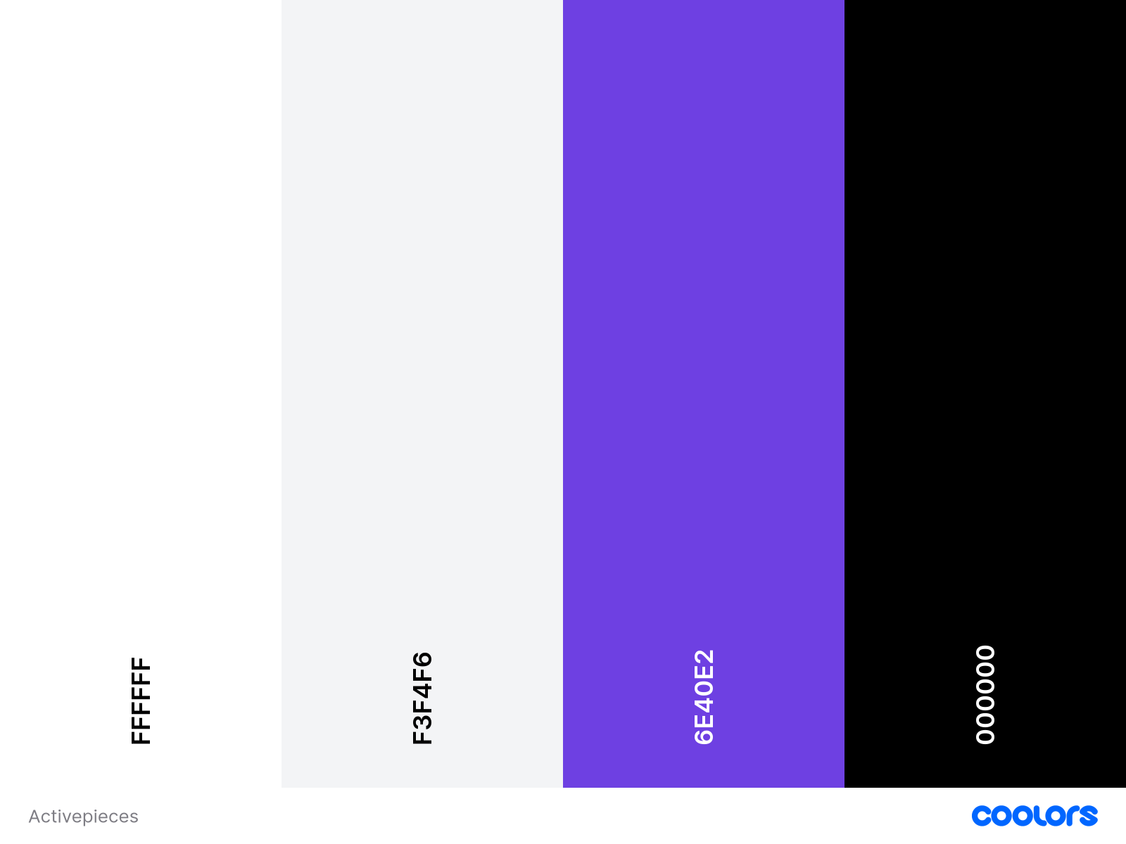
Color Palette
The palette includes:
Primary colors for main actions and branding
Secondary colors for supporting elements
Semantic colors for status and feedback (success, warning, destructive)
Tech Stack
Our frontend is built with:
React
- Core UI framework
Shadcn UI
- Component library
Tailwind CSS
- Utility-first styling
Learning Resources
Interface Design (Chapters 46-53)
from Getting Real by Basecamp
Suggest edits
Raise issue
E2E Tests
Assistant
Responses are generated using AI and may contain mistakes.