


What Is a One-Pager Template and How Do You Use It?
Ashraf Samhouri
Feb 20, 202611 min read

Have you ever been told to “just send a one-page summary” and wondered, “How am I supposed to fit all of this into one page?”
You start writing, then rewriting, then cutting things out, and somehow it still feels like everything important is missing.
A one-pager template makes that job easier by giving you a simple structure to follow.
In this guide, you’ll learn what a one-pager template is, plus the key elements and layout that make it effective.
TL;DR
- A one-pager template helps you present your business idea, solution, and proof on a single page so readers can make a quick decision.
- It should include a strong headline, a defined audience, a clear problem, a simple solution, key benefits, proof, and one clear CTA.
- Keep the layout clean with strong hierarchy, readable fonts, and enough white space.
- You can automate your one-pager template creation with Activepieces to generate accurate, ready-to-share versions from live data.
What Is a One-Pager Template?
A one-pager template helps you condense complex business information into a concise format. It lets you present the most important details on a single page so potential investors or external stakeholders can understand your idea quickly.
You emphasize the problem you solve, outline the solution, and support it with proof such as your company’s performance or early traction.
A one-pager usually follows a set layout. You start with your logo and headline, then move into the problem and solution. After that, you list the benefits and end with the next step.
What Is the Purpose of a One-Pager Template?
A one-pager template allows people understand your business or project quickly and make decisions without reading long reports. You can use it in many situations, depending on your goal.
Here’s what a one-pager is meant to do:
- Help investors or business partners review a proposal in three to six minutes and decide on the next step.
- Present your startup clearly by explaining user engagement metrics, financial performance, and market opportunities.
- Act as a company overview you’ll share with customers during early conversations.
- Provide a snapshot of timelines, milestones, and team responsibilities for any project.
- Share business information at networking events or conferences, either digitally or in person.
- Support sales teams reach out to potential customers with a focused message.
Key Elements of a One-Pager Template
These are the essential elements of a one-pager template:
1. Headline
Your headline carries more weight than any other line in the document because it decides whether someone keeps reading or moves on.
A reader should understand your core value in under five seconds, especially if you want to capture the attention of a potential investor or business partner who reviews dozens of proposals each week.
Compare these two examples:
- Weak: “Our New AI Project Management Software.”
- Strong: “Reduce Operational Costs by 20% With AI-Driven Automation.”
The second version speaks directly to a measurable result and ties back to your value proposition. Some of the most effective headlines identify a problem immediately to build empathy.
For example, “Tired of Inefficient Finance Systems? Our Platform Speeds Up Transactions by 50%.” When writing your headline, keep your target market in mind and focus on the outcome they care about most.
2. Target Audience Statement
Right below the headline, the target audience statement clarifies exactly who the page is for and what challenge defines their daily work. You basically say to your readers, “I know exactly who you are and what you’re dealing with.”
To write it well, you need to understand the psychology of their role, including their goals, pressures, and metrics.
You can use the “Who + Struggle” formula, such as “Specifically designed for boutique e-commerce founders who are frustrated by inventory errors across multiple platforms.”
Clear language helps your target market feel understood from the first page, too.
3. Defined Problem
After defining the audience, present the problem that gives your document purpose.
Describe what goes wrong, how often it happens, and what it costs in lost revenue, wasted hours, or missed opportunities. Make each point specific so the reader sees their own situation reflected back at them.
Avoid mentioning your product or service here. Let the reader sit with their frustration for a moment. You want them thinking, “Yes. That’s exactly what we are dealing with. How do we fix it?”
Outline the visible symptom, explain the root cause, and highlight the consequences of doing nothing.
When you state the main point of tension, the gap between the current state and the desired outcome becomes obvious and urgent.
4. Explanation
Once the problem feels real, the reader naturally asks how your project solves it. In the explanation, you answer that question in a structured way.
In here, you can apply the “Rule of Three:”
- Describe how a user connects existing data or shares initial important information.
- Outline the core action your system or team performs.
- Show the final result the user receives.
For instance, connect your data in one click, analyze and organize workflows automatically, then receive a ready-to-use report every Monday.
Each step should move toward a result so the reader understands both the process and the benefit.
5. Key Features or Benefits
Features describe what something has, but benefits explain why it’s needed.
Always lead with the benefit and then support it with the feature that makes it possible. After writing each point, ask yourself, “So what?” If the answer is not obvious in terms of time saved, cost reduced, or revenue gained, rewrite it.
Limit this section to three to five benefits. Highlight key details that reinforce your value proposition and make the offer concrete. Include only essential information that helps the reader decide.
6. Supporting Proof
You need evidence to build trust. Introduce key team members if their experience strengthens confidence in your delivery. Share clear numbers related to growth, retention, or results so the reader sees proof.
You can also add information about your business model if that reduces uncertainty and shows how you generate value. Specific data, short testimonials, and measurable results further help build trust.
7. Call to Action
Every section above guides the reader toward this moment where you invite them to take a specific action. A phrase such as “Get a Free Quote” feels approachable, while “Sign a 12-Month Contract” is a bit risky.
Additionally, never include more than one primary call to action (CTA). If you ask readers to email you, call you, visit your website, and follow you on social media at the same time, they’ll likely choose none of them.
Select the single action that moves the decision forward and present it so the reader knows exactly what to do next.
One-Pager Layout and Format Best Practices
Design selections shape how your one-pager feels and how quickly someone understands it, so let’s walk through the key layout and format practices you need to know.
One-Page Constraint
When someone receives a single sheet of paper or opens a single PDF, their brain registers it as a low-time-commitment task. That’s the psychology of the single page. Yet, the moment they see “Page 1 of 3,” attention declines.
Always keep in mind that a one-pager isn’t a full business plan, and it shouldn’t feel like one. If it stretches into two pages, focus disappears.
To stay within one page, you have to be ruthless. When a sentence doesn’t support your main idea or CTA, delete it. Every word should justify its space.
Vertical vs Landscape Pager Format
Choosing the right pager format affects how your audience absorbs your ideas.
You can use a vertical format when your page follows a top-to-bottom structure, such as problem→solution→benefits→CTA. It mirrors how people read on phones and standard pages.
Landscape, on the other hand, is better when you rely on visuals, charts, or comparisons that need horizontal space.
Other considerations:
- Choose the vertical layout if your content is mostly text.
- Choose the landscape layout if visuals dominate.
- If readers will print the page or view it on a phone, vertical is easier to follow.
- If they will review it on a wide screen during a meeting, the landscape may fit better.
Let the goal guide how you create the final version.
Visual Hierarchy
Visual hierarchy controls where the eye goes first and what stands out most. Without it, everything competes for attention. With it, readers follow a path from headline to CTA.
Three elements shape hierarchy:
- Size: The largest element draws the eye first, so the headline should stand above subheaders and body text.
- Color: Use your primary branding color for the CTA or key numbers and keep secondary text neutral.
- Weight: Bold key phrases so that readers can grasp your message quickly while skimming.
Limit yourself to two fonts as well.
- A display or serif font can anchor headlines.
- A sans-serif font keeps body text readable.
Font Sizing
Font size creates structure. For A4 or US Letter pages, follow:
- Headline: 30 to 45 points
- Subheaders: 18 to 24 points
- Body text: 10 to 12 points
- Captions: 8 to 9 points
As the body text drops below 10 points, you have too much content. Aside from that, adjust the spacing between lines.
Lastly, aim for a line height between 1.4 and 1.6 to prevent text from blurring.
White Space
White space gives your content room to breathe and helps readers focus on your main ideas.
When every inch of the page is filled, the design feels crowded. Strategic spacing separates sections and stresses priorities.
Leave generous margins and space between sections so each block of content feels distinct. Around your CTA, create extra space so the action stands out naturally.
It also improves readability when you print the document.
Before finalizing, step back and look at the page as a whole. Once it appears dense or gray from a distance, reduce text and simplify ideas.
Brand Consistency
Brand consistency ties everything together. Strong branding reinforces your message and builds recognition.
These are the elements you need to consider:
- Color palette that matches your official branding and stays consistent throughout the page.
- Typography that reflects your website and other materials, limited to two font families.
- Imagery style that remains consistent in tone and shape.
When branding stays aligned, your message feels unified and professional, and your one-pager becomes a natural extension of your company identity.
Automate Your Business One-Pager Template Creation With Activepieces
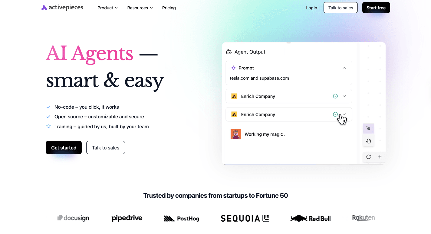
Creating a one-pager manually often turns into a repetitive process. You gather numbers, rewrite sections, update formatting, and repeat the same steps for every new client or project. That cycle consumes time and increases the chance of small but costly errors.
Activepieces helps you automate that entire process. It is an open-source automation tool that connects your apps into structured workflows. Currently, it offers 635+ data integrations called pieces.
With just a few clicks, you can trigger a flow when a new deal appears in your customer relationship management (CRM) platform or when a spreadsheet updates. The system pulls the data, refines the outline with an AI step, and fills your document template automatically.
It further lets you:
- Get live data from CRM, spreadsheets, or forms for accurate metrics
- Generate benefit statements or summaries using built-in AI pieces
- Fill your one-pager template automatically without copy and paste
- Send the final document to email, drive, or Slack for review
- Add approval steps so a manager can review before sending
With Activepieces, your team builds the workflow once and lets it handle every new version.
FAQs About One-Pager Template
How do you write a one-pager?
Start by defining the goal. Decide what you want to communicate and who the page is for. Then outline the core sections in this order: headline, short audience statement, defined problem, solution, benefits, proof, and a CTA.
Keep the content focused on one main idea. Add your logo at the top, use consistent branding, and include only the most important services or results. Cut anything that doesn’t support the main point.
How does a one-pager look?
A one-pager is a clean single-page document with clear sections and a strong visual hierarchy. It usually includes a bold headline, short paragraphs, a few bullet points, proof such as numbers or testimonials, and a next step.
How to make a one-pager in Word?
Open a blank document in Word and set margins to normal. Create a simple outline using headings for each section. Use two columns if needed.
Insert your logo, adjust fonts, and keep spacing clean. Save it as a PDF before sharing on your website or by email.
What’s the ideal layout for a one-pager?
The ideal layout keeps information organized and easy to scan. A top-to-bottom flow is suggested for most cases. Use clear sections, strong headings, and enough white space.
Think of it as a focused collection of your most important points, not a compressed version of your entire company story.

Written by
Ashraf Samhouri